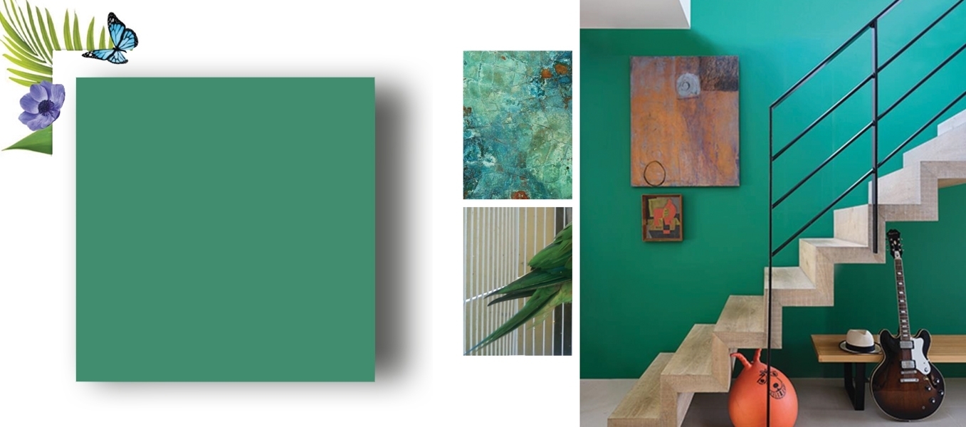
INTRODUCING 16 NEW COLORS
For the first time, Farrow & Ball has created a brand new palette of 16 colors in collaboration with renowned institution the Natural History Museum, inspired by the true colors of nature.
The new Color by Nature palette of 16 hues includes vibrant and jewel like oranges and reds, natural and opulent greens and blues and a range of soft neutrals.
This new collection is a celebration not only of color, but also of the shared respect and curiosity for the natural world.
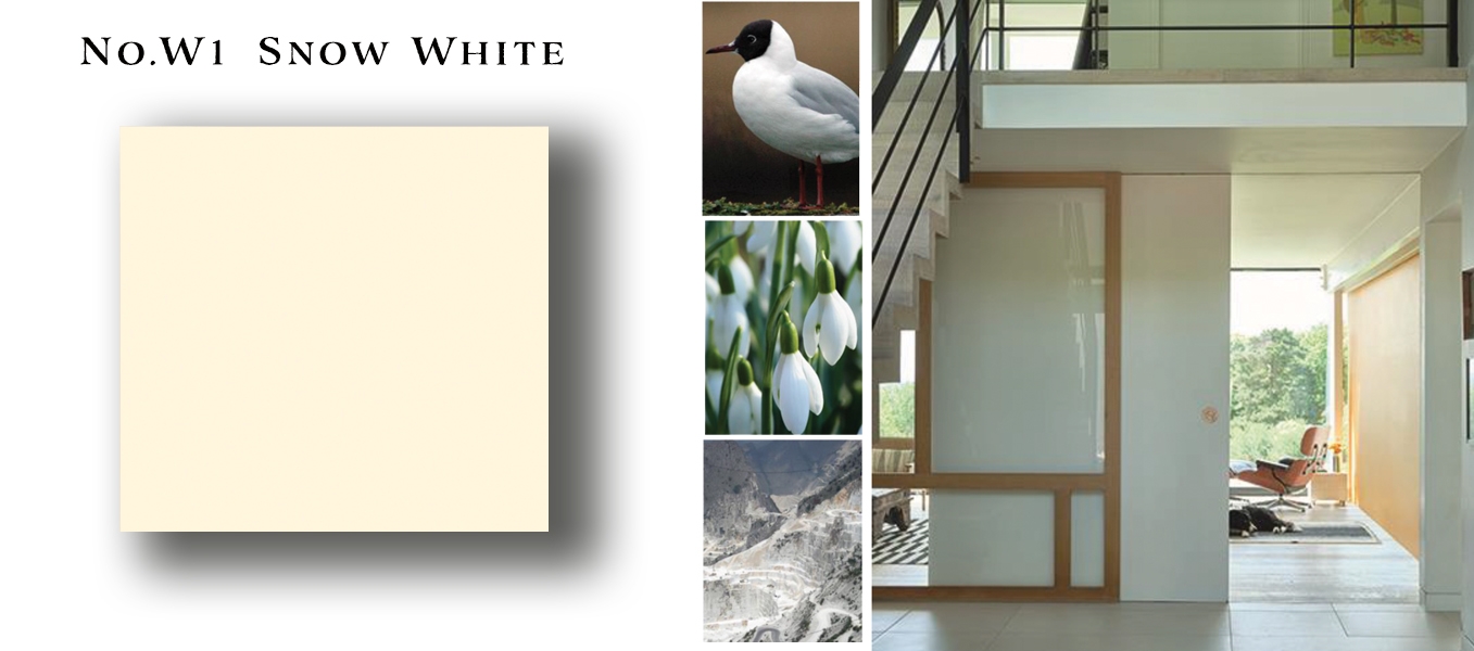
No.W1 SNOW WHITE
A fresh, delicate white
Snow White is a wonderful alternative to a pure white, versatile enough to be used on woodwork and ceilings alongside any other color. A tiny hint of yellow pigment is the secret to its warm and reflective nature, bouncing light around in even the darkest of spaces and creating rooms with a laid back feel.
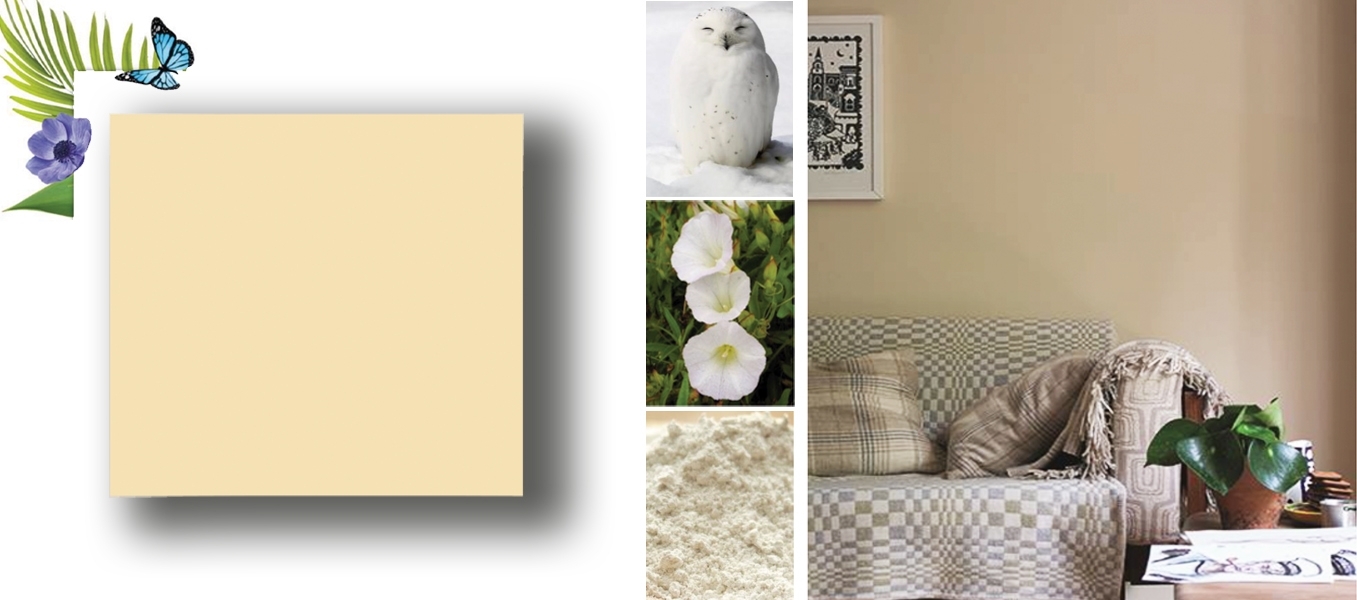
No.W5 ORANGE COLORED WHITE
A warm cream with a hint of orange
Orange Colored White is a fresh yet warm cream particularly suited to north facing spaces. The addition of the merest amount of red pigment to this earth based neutral adds a delicate luminosity without feeling too creamy, creating delightfully warm rooms that appear to glow.
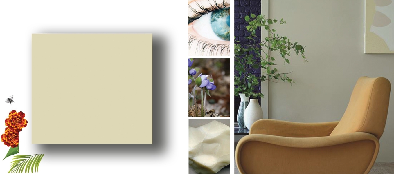
No.W7 SKIMMED MILK WHITE
A mid tone off white
Skimmed Milk White is a mid tone off white with extraordinary softness. Its laid back nature creates rooms that feel as if they have been that color forever,whether used on woodwork alongside a stronger wall color, or on walls with a Snow White trim for a more contemporary feel.
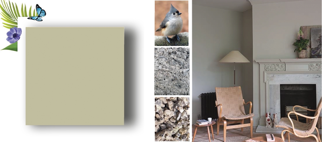
No.W9 ASH GREY
A relaxed green grey
Ash Grey has a relaxed feel that makes it suited to any space, particularly when combined with the slightly warmer Skimmed Milk White on woodwork. For a more modern look, try teaming with a lighter Snow White trim. The underlying green in this shade means that it will appear more intensely colored in natural daylight and grayer in areas of low light.
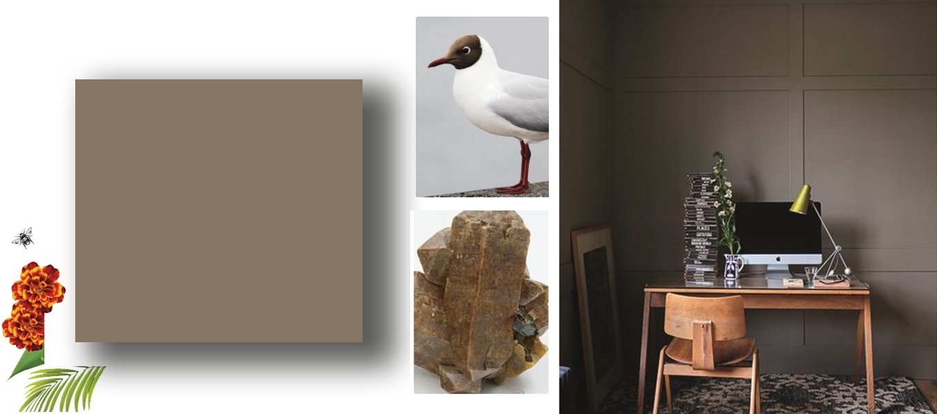
No.108 BROCCOLI BROWN
A quiet dark stone
Broccoli Brown is a quiet dark stone color that sits effortlessly alongside natural materials such as weathered wood or flagstone floors. Its muted quality makes it ideally suited to studies, where its reserved tone serves as the ideal backdrop, especially when taken over the ceiling as well as the walls.
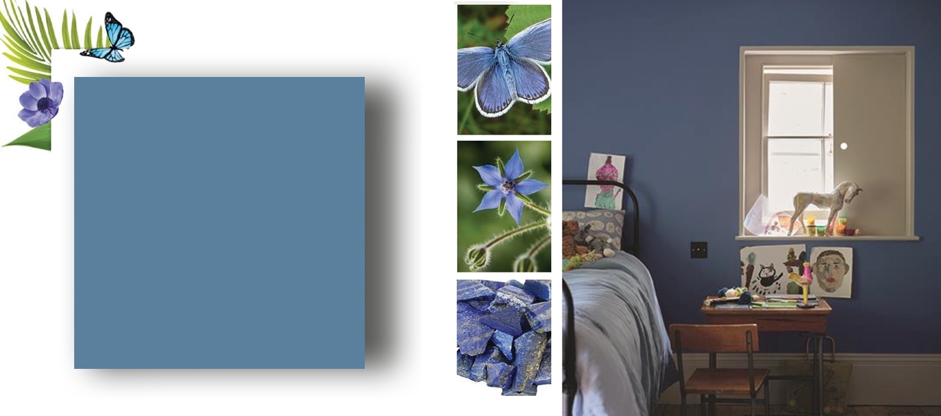
No.W29 ULTRA MARINE BLUE
A romantic mid toned blue
A stunning blue with a slightly romantic feel, Ultra Marine Blue has been infavor since the 18 th century, when it was often used to make small rooms feel bigger. For the contemporary home, it looks striking on cabinetry, especially combined with a kitchen island in dramatic Scotch Blue.
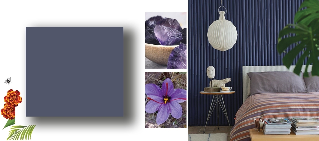
No.W40 IMPERIAL PURPLE
A rich deep purple
Deep Imperial Purple transforms dining rooms and other intimate spaces, creating a luxurious look and enveloping feel. Used in smaller quantities, such as inside a bookcase, it can add a rich pocket of color to even the most neutral of rooms try it with soft Snow White and Ash Grey for a relaxed scheme with a playful touch.
No.W24 SCOTCH BLUE
A deep, intense blue
This intensely pigmented blue brings a smart look and luxurious atmosphere to any room, especially those designed for entertaining. Particularly eye catching when combined with Ash Grey woodwork, Scotch Blue creates inviting spaces that you can’t wait to escape to at the end of the day.

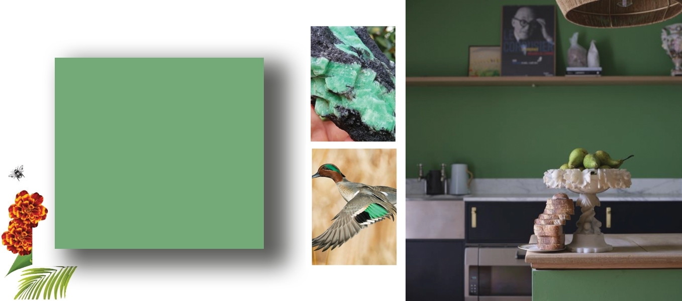
No.W53 EMERALD GREEN
A bright, uncomplicated green
Emerald Green is easy to use in all sorts of homes, creating rooms with an upbeat yet elegant atmosphere. This beautiful jewel tone makes an excellent addition to strong multi colored schemes, especially alongside Lake Red and Ultra Marine Blue, where it strikes a balance between being vibrant and soothing.
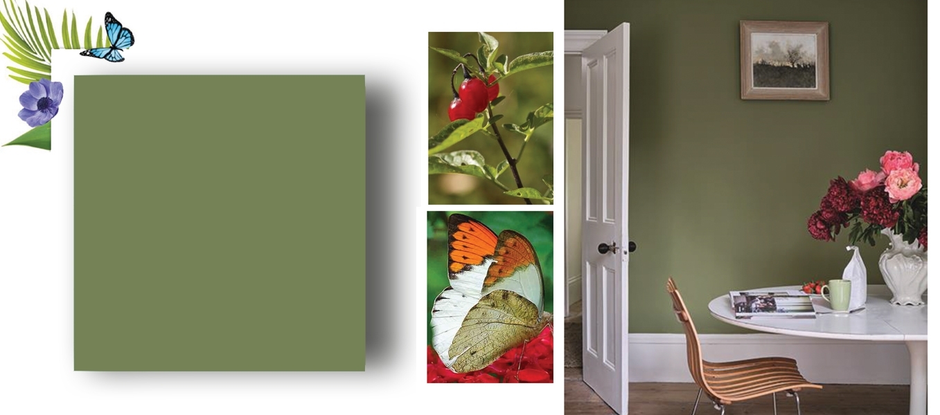
No.W56 SAP GREEN
A true earthy green
This organic green is a true reflection of nature, creating a soft, lived in atmosphere when combined with Broccoli Brown and Duck Green. Used in smaller spaces, such as a hallway or porch, it creates a richer, more vital atmosphere.
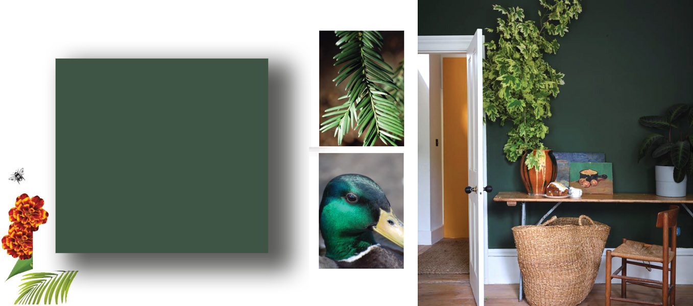
No.W55 DUCK GREEN
A smart deep green
Named after the deep green plumage of a mallard, Duck Green is a wonderful reminder of the exquisite colors of nature. Strong but subdued, it offers a contemporary alternative to charcoal shades for modern homes, and makes a warm and welcoming pair with Deep Reddish Brown on woodwork.
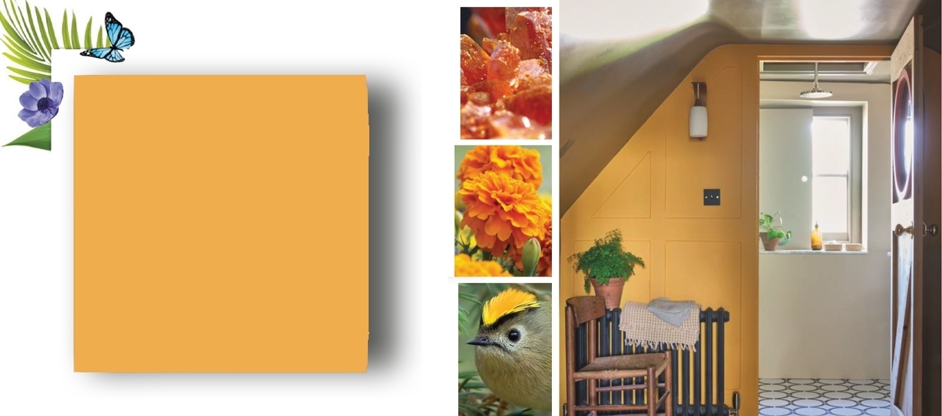
No.W76 DUTCH ORANGE
A clean bright orange
Dutch Orange is a clean bright orange with the ability to enliven any space. With a dynamic quality that brings an enveloping warmth to rooms, it feels lively combined with Verdigris Green and Skimmed Milk White, and looks particularly stunning with a Duck Green trim.

No.W92 LAKE RED
An adventurous cool red
This adventurous color appears red to some and pink to others, but always feels happy and vital. Fantastic in small spaces, Lake Red feels dynamic and energizing used across walls, woodwork and ceilings, and works wonderfully inside cupboards.
No.W93 CRIMSON RED
A deep, warm pink
This deep, warm pink creates spaces that feel soft and inviting, especially when teamed with Skimmed Milk White on woodwork. Paired with dark tones, however, Crimson Red takes on a glamorous feel, with Scotch Blue in particular bringing out its rich and romantic nature.
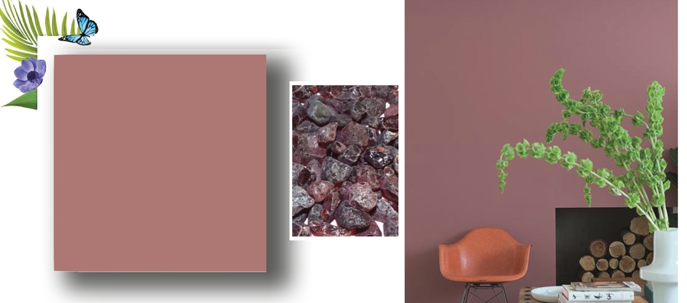

No.W101 DEEP REDDISH BROWN
A deep, earthy brown
Deep, warm and welcoming, this shade was once popular in country houses, where it was often used to highlight the woodwork of back stairs. In a contemporary setting, it still makes a wonderful color for walls, doors and trim alike, adding richness and drama to any space.
No.W50 VERDIGRIS GREEN
An elegant copper green
While happy and lively on first glance, Verdigris Green retains a reassuring feel and underlying elegance when used in the home. A rich blend of pigments allows it to feel more vibrant teamed with lighter tones than with darks, and it takes on added vitality when combined with Dutch Orange or Lake Red.
